The ‘Handwritten’ Logo
 News Corporation announced this week that it is separating its business “into two distinct publicly traded companies, 21st Century Fox and the new News Corporation”. at the same time, News unveiled a new logo based on the handwriting of Rupert Murdoch and his father and company founder, Sir Keith.
I can only assume that the logo designers gave Sir Keith and Rupert one word each, or they have very similar handwriting, or the logo is actually a morph of their two styles.
My bet is the father and son have very similar handwriting – and that similarity must have really struck the designers when they started the re-branding project.
So what does a corporate logo based on handwriting signify? At its most basic level it ensures the logo’s originality. Each person’s handwriting is unique, so a logo with that as its origin is unlikely to be replicated, which can’t be said for text-based logos that use a computer font as their starting point.
What’s interesting is that most handwritten logos are based on the name of their founder, and often written in their own hand. There’s a nice blog post from a few years ago on famous trademarks created using handwriting , and all of those listed are based on the founder – even audio manufacturer Olive’s name is based on its founder and CEO – Oliver Bergmann. Some of these companies’ history dates back well over 100 years – Boots, Harrods, Ford, Kellogg’s – but the origin of the business will never be lost, thanks both to the name of the company and the handwritten logo associated with it.
However, News Corporation didn’t have that advantage, despite the company’s age and its strong Murdoch family connection. Originally founded as News Limited in Adelaide by Sir Keith Murdoch in 1923, and now one of the world’s largest media and entertainment businesses under singular control and direction of Rupert Murdoch, News Corp is in danger of losing a sense of its history and identity when Rupert eventually steps aside, with the next generation of Murdochs not looking likely to exert the same level of leadership, as reported in the AFR:
Although Mr Murdoch’s sons James and Lachlan will be on the company’s board (as well as that for the other company, 21st Century Fox), the ageing media titan has had to rely on non-family executives to continue the family publishing legacy.
I wonder if there was some discussion about News Corp being rebranded to “Murdoch” or “Murdochs”? With a brand name as ubiquitous, valuable and generally descriptive as “News”, that idea would have been dismissed pretty quickly.
Instead, the reminder of the Murdoch legacy will be in the new logo. The clever thing about it is that while it remains as the News Corp brand, the logo will be forever linked not just with Rupert, but also with his father.![]() In the note to staff, News Corp CEO Robert Thomson summed it up:
In the note to staff, News Corp CEO Robert Thomson summed it up:
Today we are unveiling a new logo that will be our emblem for this future. The name is historic and the script is based on the writing of Rupert and his father, who have provided us all with not only a name, but a remarkable professional platform.
Funnily enough, the Explore Communications logo is also based on the founder’s handwriting but not his name. However, it does mark the origin of the business. At the time, I was sitting in a conference, and the speaker was discussing how businesses are in either “exploit” mode or “explore” mode – and at that moment, I had my business name “Explore Communications” – which I wrote out on the conference notepad:
 What is really striking about the News Corp logo is how unadorned and seemingly untreated it is. You get a real sense of it simply being “written” on a page by its owner. I think that’s really significant, when you consider how impersonal and “corporate” the old logo is:

I really love the beauty that can be found in handwritten logos – you only need to look at the 10 logos called out by Logo Design Love in this blog post, and the additional logos referenced in the comments below.
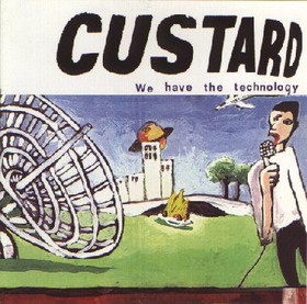
Finally, I do have to mention my favourite handwritten “anti-logo” from ‘90s Australian band Custard. I laugh every time I see it – a reminder of my own pathetic attempts as a kid to create a title page at the last minute for a school project, only to realise halfway through that you haven’t left enough room for all the letters:
(Pictured top: “Writer in the park”, by Thomas Nugent licensed for re-use by Creative Commons Attribution-ShareAlike 2.0 Generic (CC BY-SA 2.0))
